


A button is the smallest decision point in your interface, and one of the costliest to get wrong. When a button feels clear, users act without hesitation. When it doesn't, they pause, second-guess, and sometimes leave. That hesitation is not a UX statistic. It is a real moment where confidence either holds or breaks.
Most button problems are not visual. They are semantic. The wrong element, the wrong label, or a missing state, and suddenly users can't tell what's going to happen next. That uncertainty is friction, and friction compounds.
Key Takeaways
- Limit primary buttons to one per decision point. More than one force users to prioritize what the interface should have already decided for them.
- Limit primary buttons to one per decision point. More than one force users to prioritize what the interface should have already decided for them.
- Limit primary buttons to one per decision point. More than one force users to prioritize what the interface should have already decided for them.
- Limit primary buttons to one per decision point. More than one force users to prioritize what the interface should have already decided for them.
- Limit primary buttons to one per decision point. More than one force users to prioritize what the interface should have already decided for them.
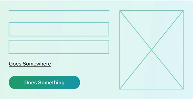
Many times developers and designers use buttons and links interchangeably, which confuses users. While they might look similar, their semantical behaviors are completely distinct:
A **button** triggers an operation (e.g. submitting a contact form, downloading a file, toggling a menu, or buying a product). A **link** points to a different web document or scrolls to a specific heading section on the current page.
Button or Link?
Many times developers and designers use buttons and links interchangeably, which confuses users. While they might look similar, their semantical behaviors are completely distinct:
A **button** triggers an operation (e.g. submitting a contact form, downloading a file, toggling a menu, or buying a product). A **link** points to a different web document or scrolls to a specific heading section on the current page.
To make interfaces feel intuitive, use proper tags. If a user click submits data, use a <button>. If it
navigates somewhere, use an <a> anchor link.
Building a Button Hierarchy That Does the Work For You
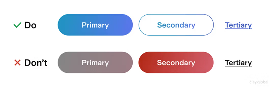
A clear button hierarchy acts like a visual roadmap, guiding users toward the most important business goals. Use a combination of primary, secondary, and tertiary styles to rank interactions:
A clear button hierarchy acts like a visual roadmap, guiding users toward the most important business goals. Use a combination of primary, secondary, and tertiary styles to rank interactions:
A clear button hierarchy acts like a visual roadmap, guiding users toward the most important business goals. Use a combination of primary, secondary, and tertiary styles to rank interactions:
A clear button hierarchy acts like a visual roadmap, guiding users toward the most important business goals. Use a combination of primary, secondary, and tertiary styles to rank interactions:
A clear button hierarchy acts like a visual roadmap, guiding users toward the most important business goals. Use a combination of primary, secondary, and tertiary styles to rank interactions:
Conclusion
Buttons are the workhorses of interaction design. Creating custom button visual logic based on user expectations is key to a polished user interface. By setting up strict styling guidelines, prioritizing contrast, and laying out clear hierarchies, you reduce user hesitation and build a premium browsing experience.
Remember to maintain accessible contrast levels, enforce tap target guidelines, and verify styling across major devices to optimize your layout.